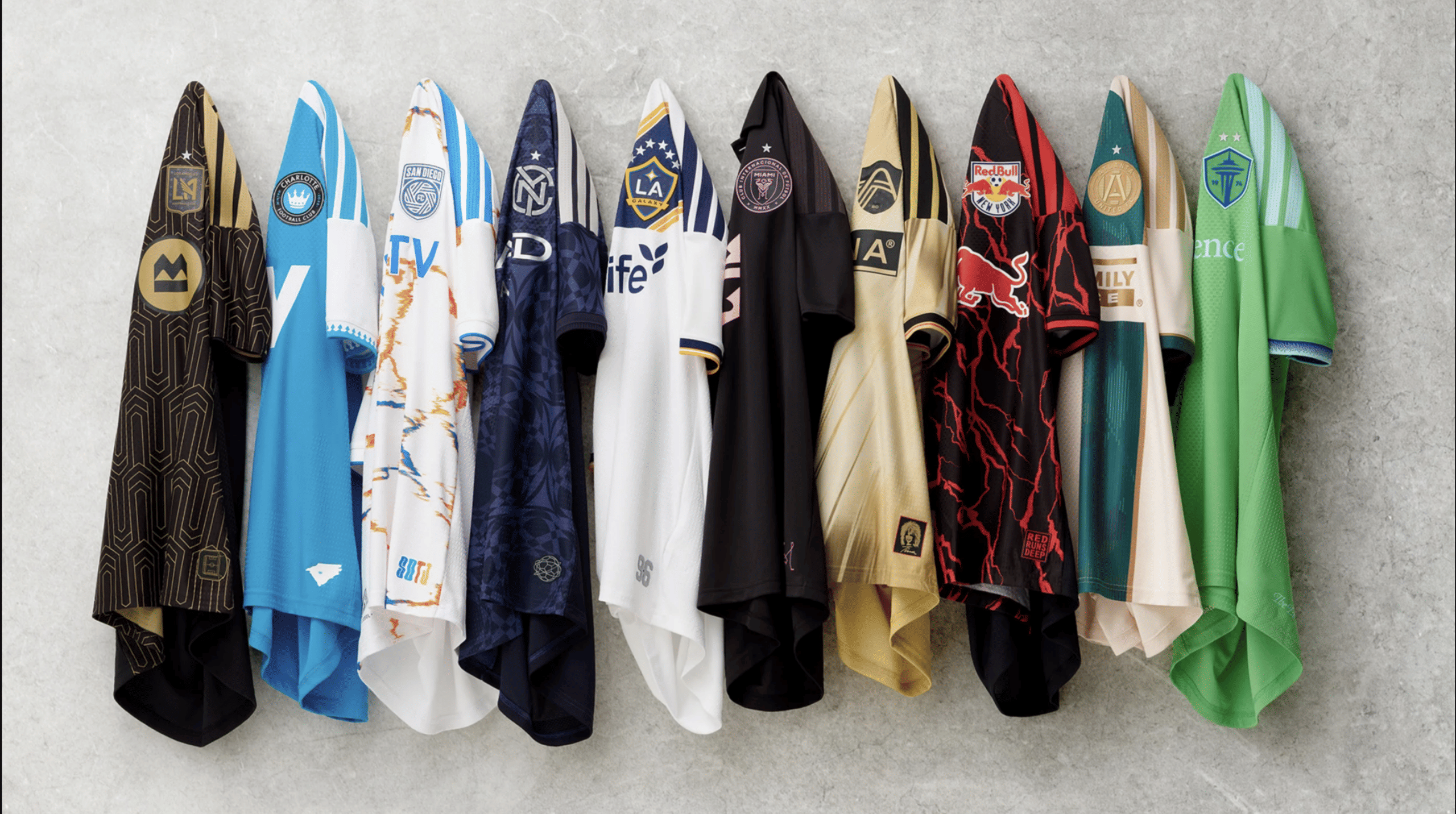
MLS 2026: Ranking jerseys of all 30 clubs from worst to best
(Courtesy : MLS)
Some new aesthetic jerseys will take centre stage this MLS season.
Major League Soccer’s appearance has only gotten better since the days of the plain white shirt were over a few years ago. With many of the league’s 30 clubs revealing potentially memorable styles, 2026 is a fantastic year to embrace colour and unconventional thinking.
This year, the secondary kits are the main attraction, even if many teams switched up their primary outfits for the 2025 season, frequently going with more subdued hues and patterns. Although some might have gone overboard, MLS clubs will all wear eye-catching outfits for the league’s 31st season.
30. St. Louis CITY SC
Although it is dazzling and unmistakably recognised for this season, the so-called “Tina Tuner Kit” doesn’t really represent Turner, the city, or the team.
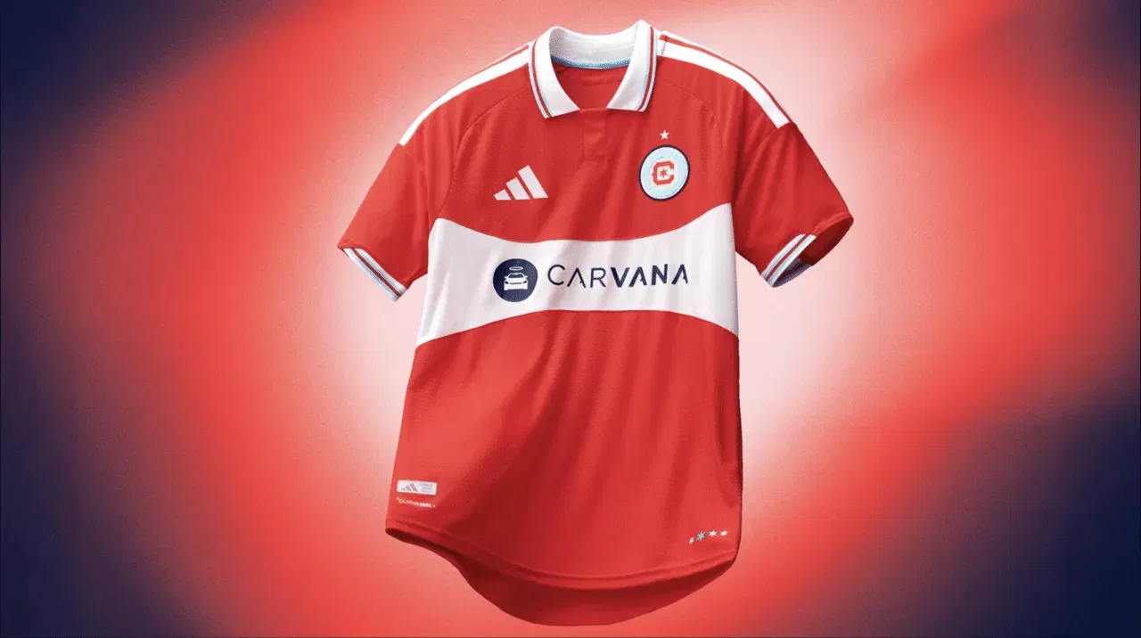
29. Inter Miami
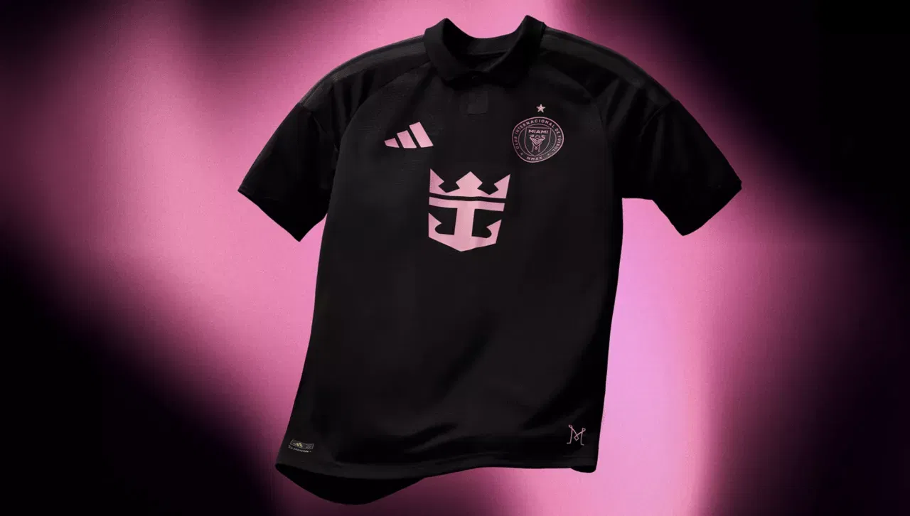
With its distinctive colour scheme and recent success under Lionel Messi, Inter Miami have the opportunity to make history in soccer outside of Major League Soccer.
Not as a result it’s bad, or the collar is a little drab, but rather because it might have been so much better, their all-black secondary kit doesn’t make much of an impression. Their pink primary, nevertheless, is to like.
28. D.C. United
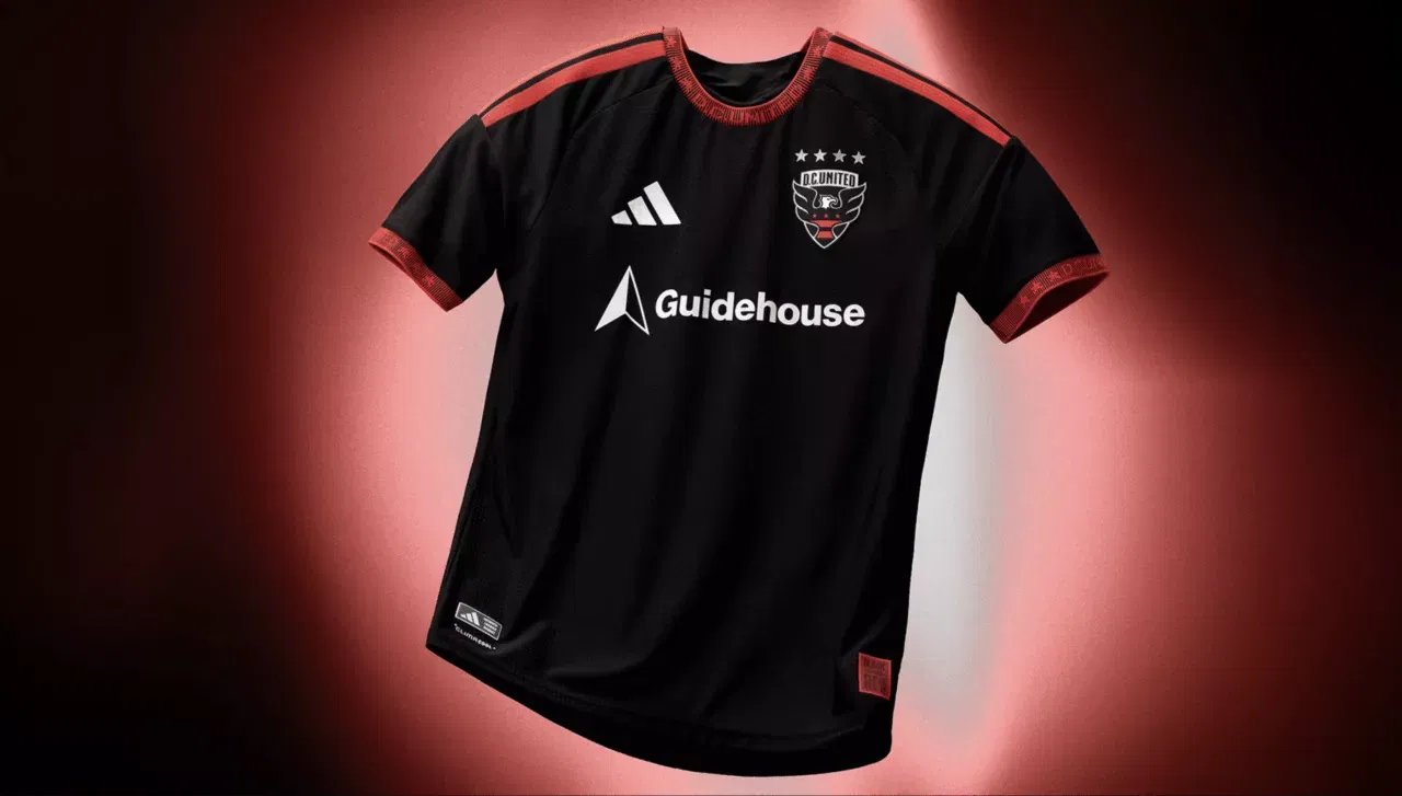
Is this new, indeed? Welcome to D.C. United. Although their hiring for this season makes some sense, their mostly black jersey and crimson accent hardly mark the start of a new era.
Everything is alright. It’s secure. It’s essentially the same.
27. Orlando City
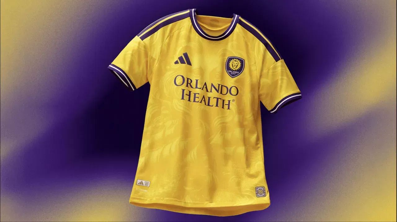
Orlando City haven’t used bright yellow in the past, and it doesn’t stand out as the complementary gold in their primary purple scheme. They appear to have eleven goalkeepers on the field at once, in addition to looking like Nashville.
26. Nashville SC
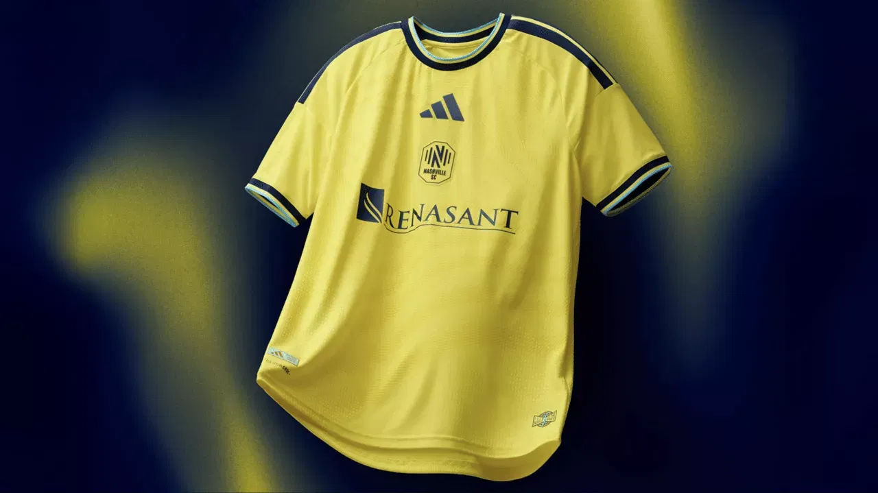
Nashville SC have a distinct identity as it prepares for the 2026 season, much like the Seattle Sounders. All you need to know is that this is Hany Mukhtar’s side, and they wear bright yellow when they play. However, this year’s crest is clumsily positioned in the centre and seems smaller than the adidas manufacturer’s emblem underneath it.
At least the collar is kind of intriguing.
25. LA Galaxy
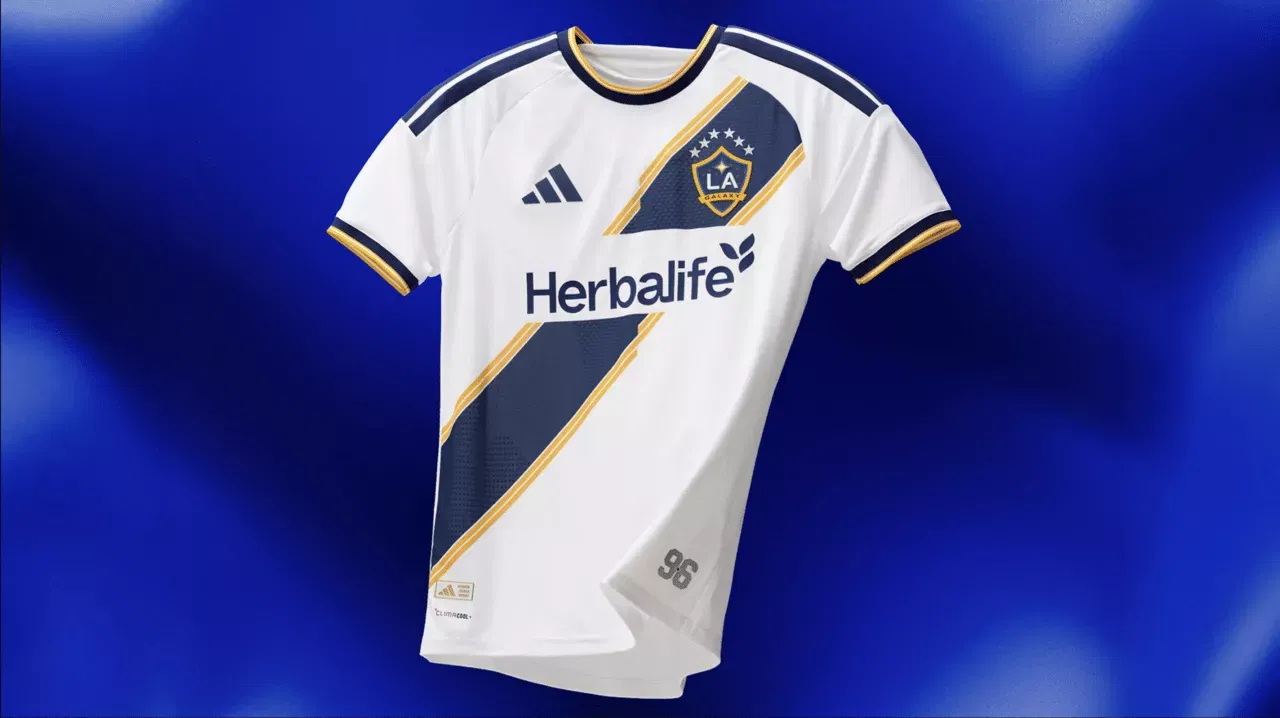
Yes, this is an LA Galaxy kit. Since the team signed David Beckham in 2007, it has remained almost unchanged and is clean and classic. Even if it means being a little average when it comes to kit ranking time, it looks classic.
24. New England Revolution
Here, the New England Revolution deserves some recognition because they have made an effort. The new primary jersey adopts the same style as the throwback third kits from the previous season, which were reminiscent of the 1990s. It’s quite imaginative and noisy.
23. CF Montréal
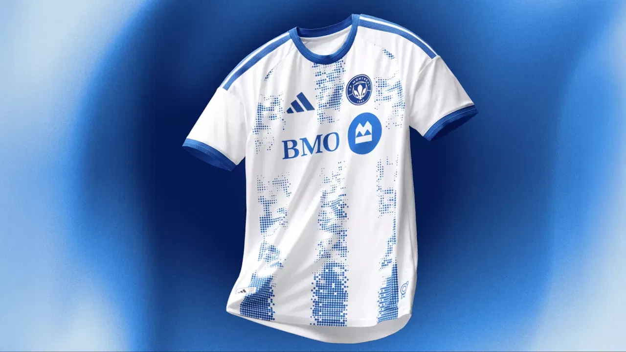
You may recognise this CF Montréal uniform if you have ever visited a select-your-seat ticketing website. Although the design is interesting, it would have looked much better before internet tickets made it appear like a map of empty seats.
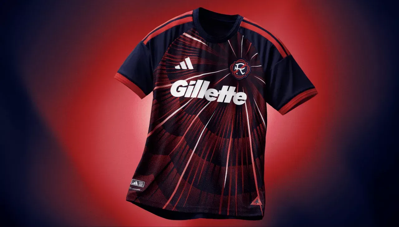
22. Red Bull New York
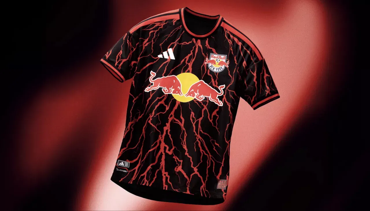
Inspired by the club’s motto, “Red Runs Deep,” this shirt combines lightning and roots. When you take into account the fast-paced style of play and Michael Bradley’s ties to the team and New Jersey, that’s a fairly solid mix.
Simply said, a lot is going on. It is somewhat distracting, but it’s eye-catching.
21. FC Dallas
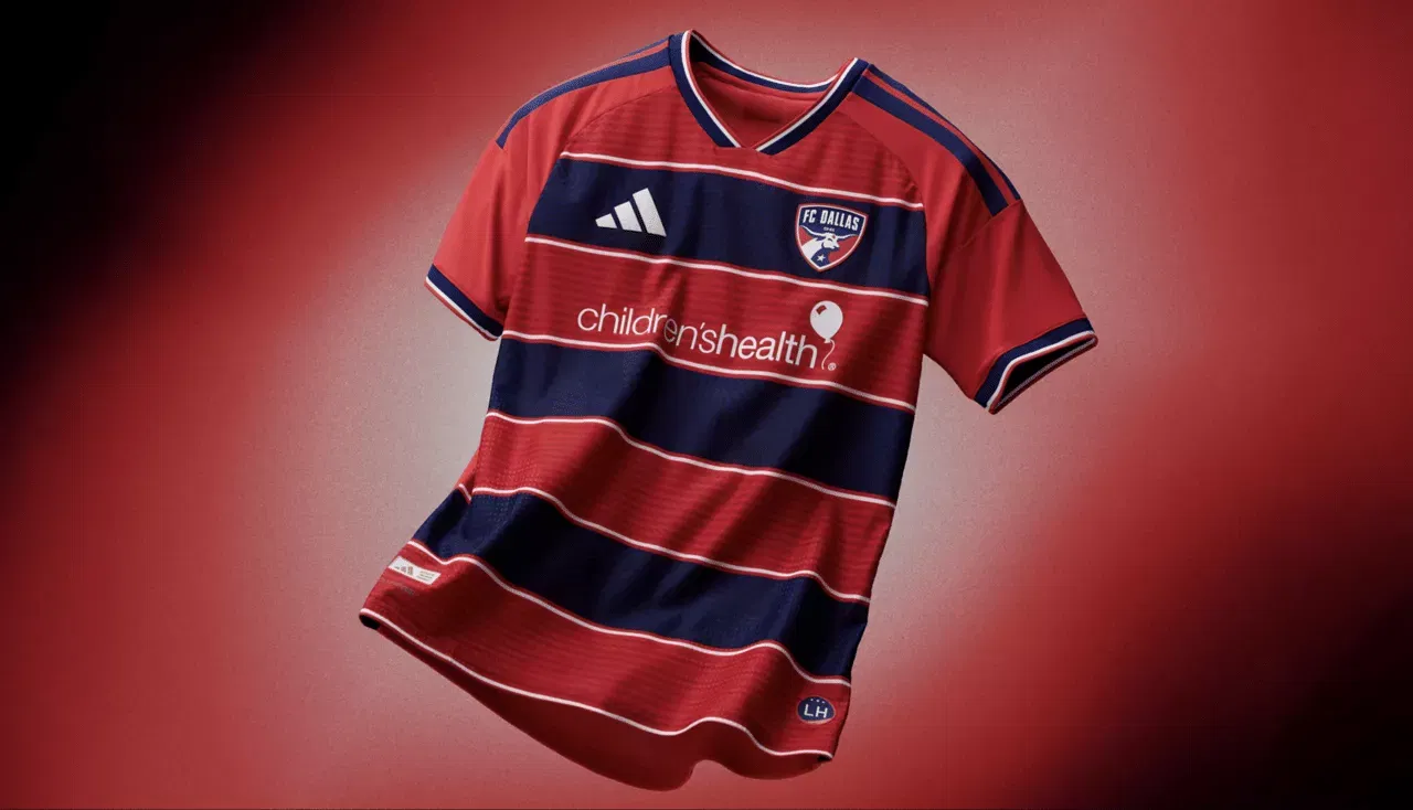
Juventus. Newcastle and Celtic. Basel. Many clubs throughout the world have recognisable styles that don’t change much from one season to the next. Even if it lacks originality, FC Dallas have discovered that the combination of their red and blue hoops and the unexpected turn for a darker shade of each colour makes this feel new.
20. Real Salt Lake
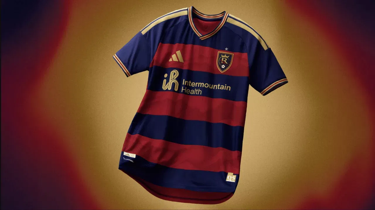
Similar to FC Dallas, Real Salt Lake must have a certain style for their main shirt, and anything that deviates from that would be unflattering. They’ve done well here, and the collar pattern adds a lovely finishing touch.
19. Houston Dynamo
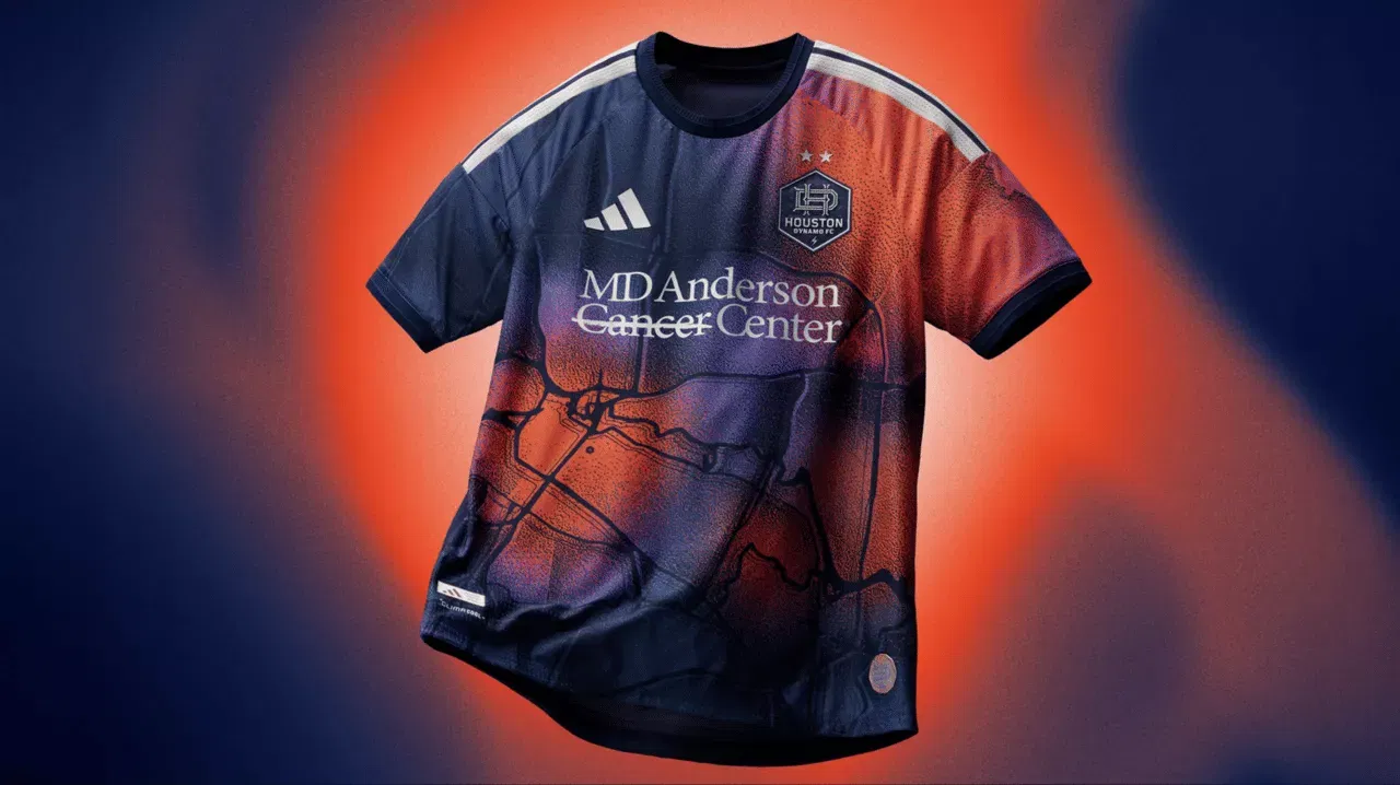
Although the Houston Dynamo have always had some eye-catching uniforms, they appear to have settled on a formula for sleek looks without going overboard in recent years. This year’s is a radical departure from simplicity, with a heat map superimposed on top of a satellite image of the city.
This is really amazing considering how much preparation and time kits require. However, it nearly seems excessive.
18. Columbus Crew
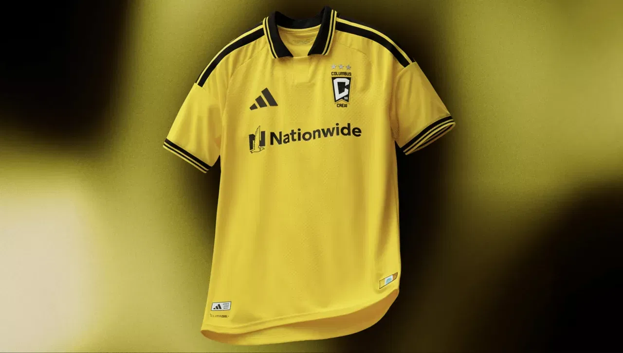
Do you recall the Columbus Crew soccer era of Federico Higuaín? When you see a collared primary uniform for one of the original MLS clubs, that’s all you can think about. Without going overboard with intricate details, it’s unmistakably a Columbus kit with a modern touch and timeless vibe.
17. Minnesota United
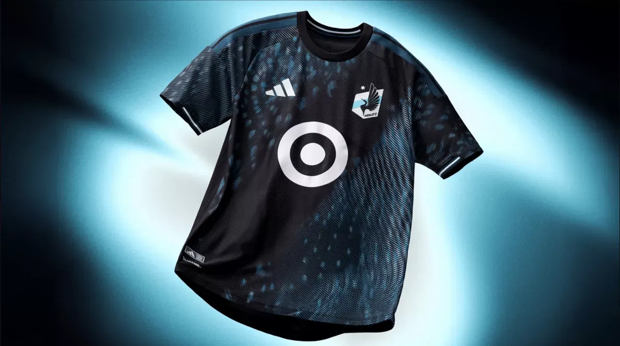
With the release of their tenth anniversary jersey and the signing of James Rodríguez, a marquee No. 10, Minnesota United had a busy week. Although this kit’s throwback features are cool, once the players wear it in games, it will just appear black.
16. San Jose Earthquakes
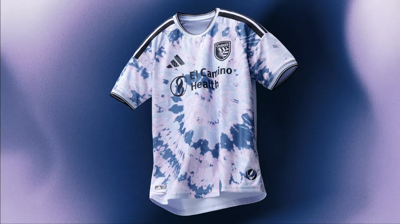
The “Dead Kit” from the San Jose Earthquakes is an unusual and striking tribute to The Grateful Dead. It can appear somewhat arbitrary, though, and doesn’t seem to fit in with the club’s other branding, history, or mood.
The fact that they signed Timo Werner, a fantastic but ineffective attacker, and lost Josef Martínez and Chicho Arango this summer also leaves them vulnerable to “dead” jokes all season long.
It is effective as a third kit. Very little as one of the two primary kits.
15. FC Cincinnati
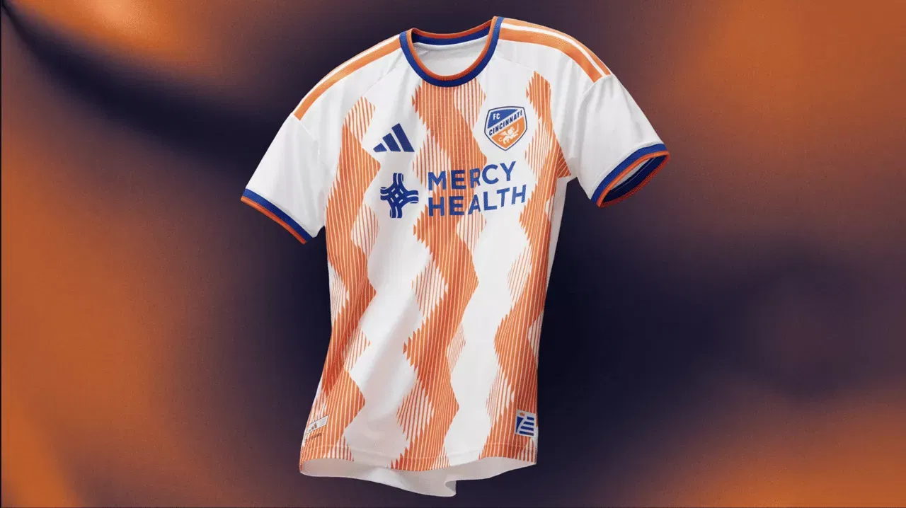
With this uniform, FC Cincinnati are definitely swinging, and it might be a lot of fun. However, it also seems to need some exciting soccer on the field. Perhaps that perspective will shift, but it’s difficult to have a colourful shirt without an entertaining team.
14. Chicago Fire FC
It’s good to see that Chicago Fire FC have finally decided on a primary look after several difficult years of rebranding, various jersey developments and additional revisions. The striped collar is amazing, and the hoop is a bit more interesting than their last one.
13. Seattle Sounders FC
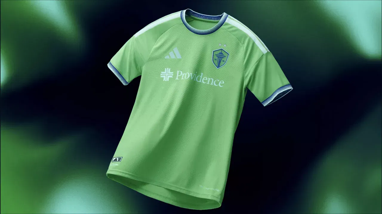
The only task for the Seattle Sounders is to keep it Rave Green during the year when they are changing up their main uniform. They’ve managed to do that for 2026, with aqua blue accents providing a vintage touch and seemingly deepening the colour a bit.
Although MLS has some legendary styles, Seattle’s is arguably the most reliable and distinctive in all of soccer.
12. Sporting Kansas City
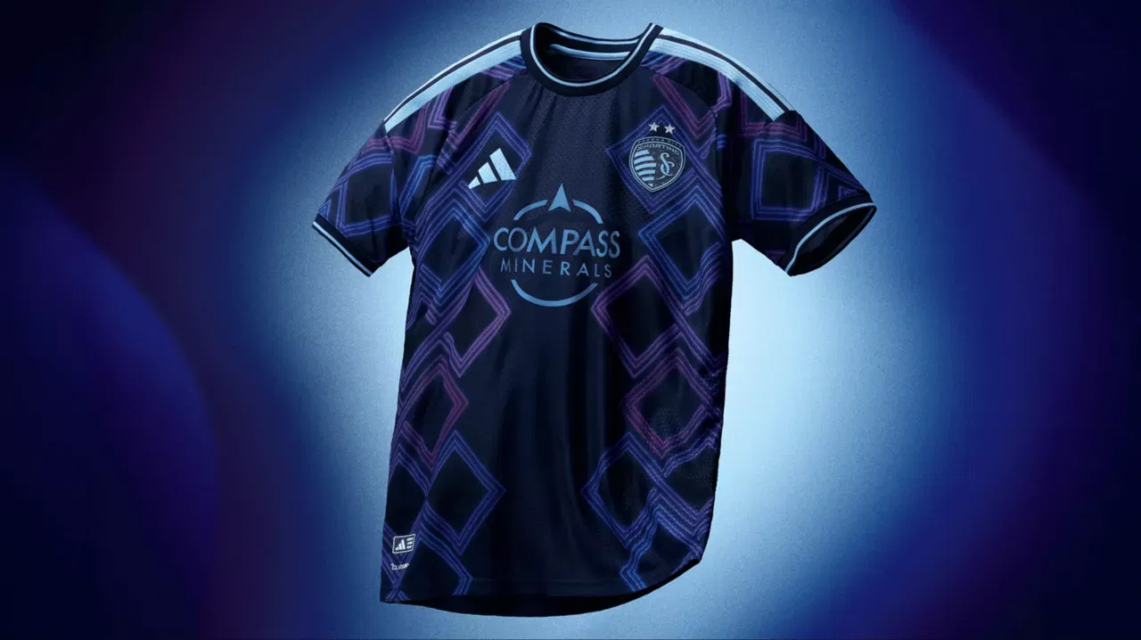
The neon-inspired embellishments and argyle diamonds, which were inspired by the Kansas City jazz neighbourhood, are great additions to a kit. Even though they alter throughout the kit, they’ve managed to make the colour clash on this one seem fantastic.
This one adds a lot of flair and bluster, but does so in a way that is tasteful and neither overpowering nor embarrassing.
11. Charlotte FC
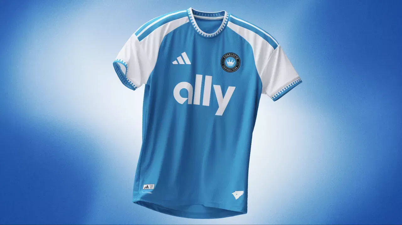
Despite being one of the more recent MLS expansion clubs, Charlotte FC have already established an iconic style with their vivid royal blue. Although it feels like a classic and should fit nicely, this one could be a bit too easy to place any higher than mid-table.
10. Toronto FC
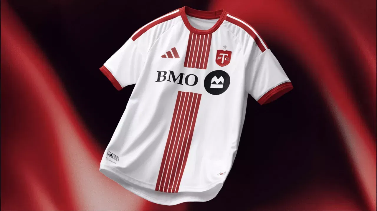
Toronto FC have finally returned with its fundamental identity after years of wearing grey shirts and very little red on either the primary or secondary. Inspired by the snow and sleet that were present for a large portion of the winter, the new away kit is red and white, while the home kit is all red.
For a team called the Reds, ideal. Regretfully, the six lines in the centre, despite their inventiveness, resemble Toronto’s second professional team, Inter Toronto, of the Canadian Premier League, almost exactly.
9. Colorado Rapids
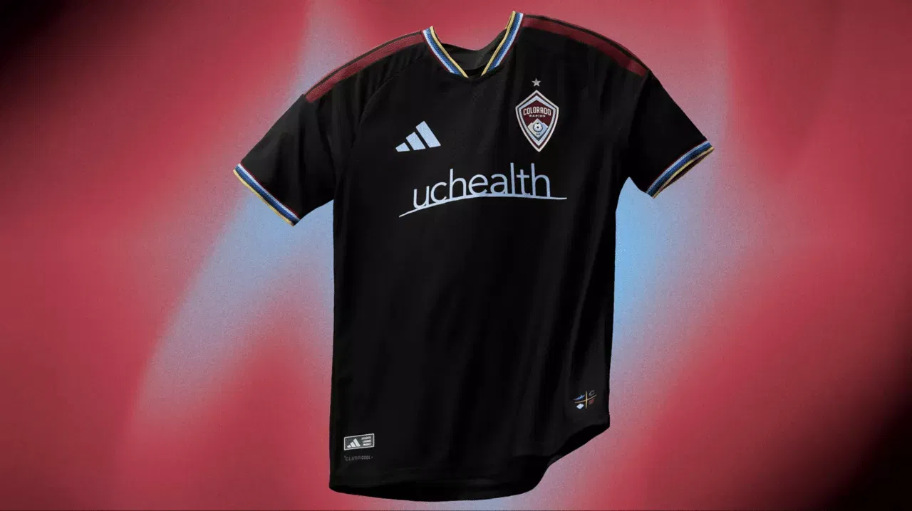
In order to find out how their supporters felt about the club’s visual identity and meaning, the Colorado Rapids surveyed them during the summer. Given the timetables, this kit would not have been constructed using those proposals; yet, the Rapids’ elegant trim and current maroon complement the club’s original colours.
8. Vancouver Whitecaps
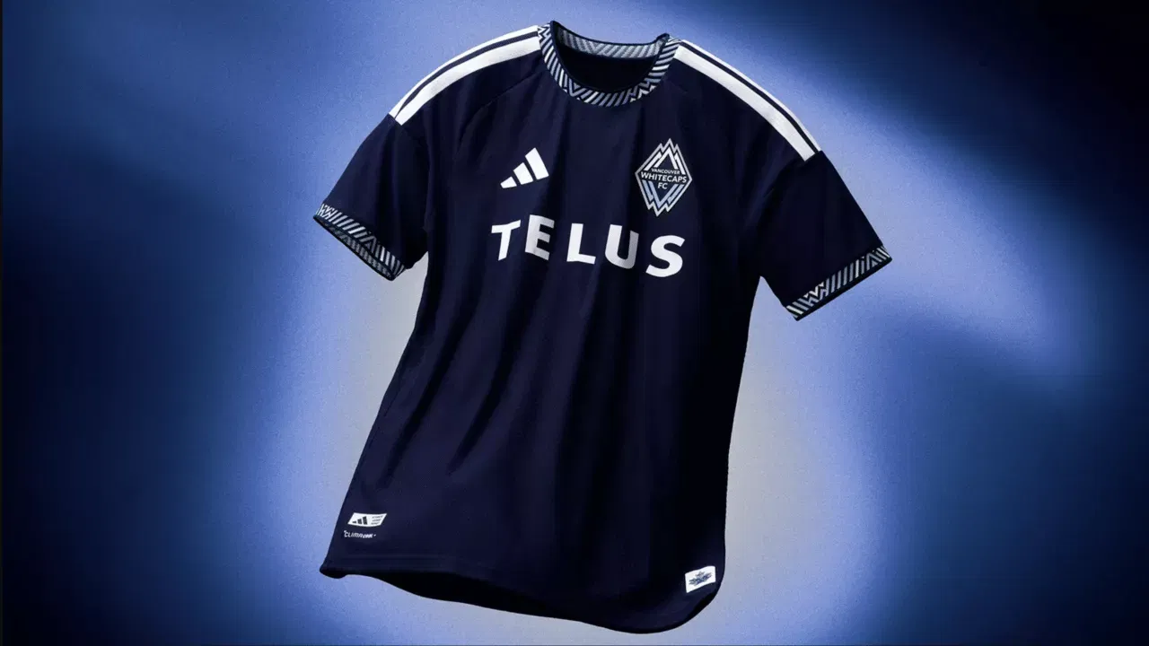
The Vancouver Whitecaps’ primary uniform, which consists of a white shirt with a blue hoop, has a distinct character. However, there have been numerous adjustments made to their secondary. It’s a fairly simple navy blue style in 2026, but the neckline and sleeves have some colour.
7. New York City FC
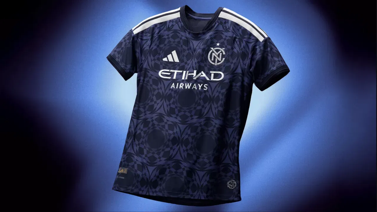
When you read the definition of an “All Nations Kit” and its implications, the 2026 New York City FC uniform is one of them that leaves you with more questions than answers.
But one response? Not every kit needs motivation.
6. Austin FC
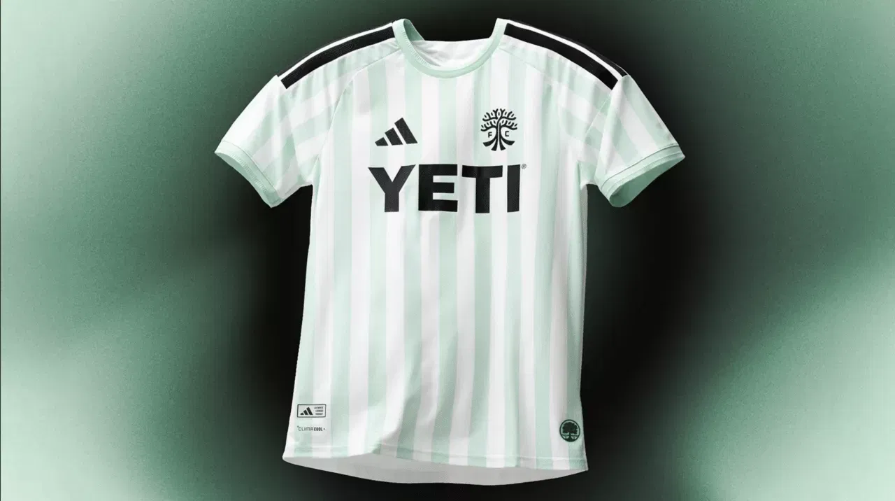
It’s unclear how this jersey captures the diverse, multicultural fabric of New York, but it looks good enough. Austin FC have experimented a lot over its MLS tenure to develop a real visual identity, switching between black, black-and-green, and totally green uniforms.
Sublimated stripes in a lighter shade of green and nearly white provide a sophisticated appearance for the upcoming period and may also serve as their identification going ahead.
5. Portland Timbers
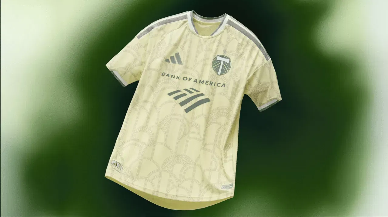
Most teams take about two years to create and manufacture their uniforms, and the Portland Timbers have a clear long-term vision for the complex styles of their squads.
This year’s uniform honours the stadium’s 100th anniversary by paying homage to Civic Stadium, Providence Park’s original name. It’s wonderful and detailed.
4. San Diego FC
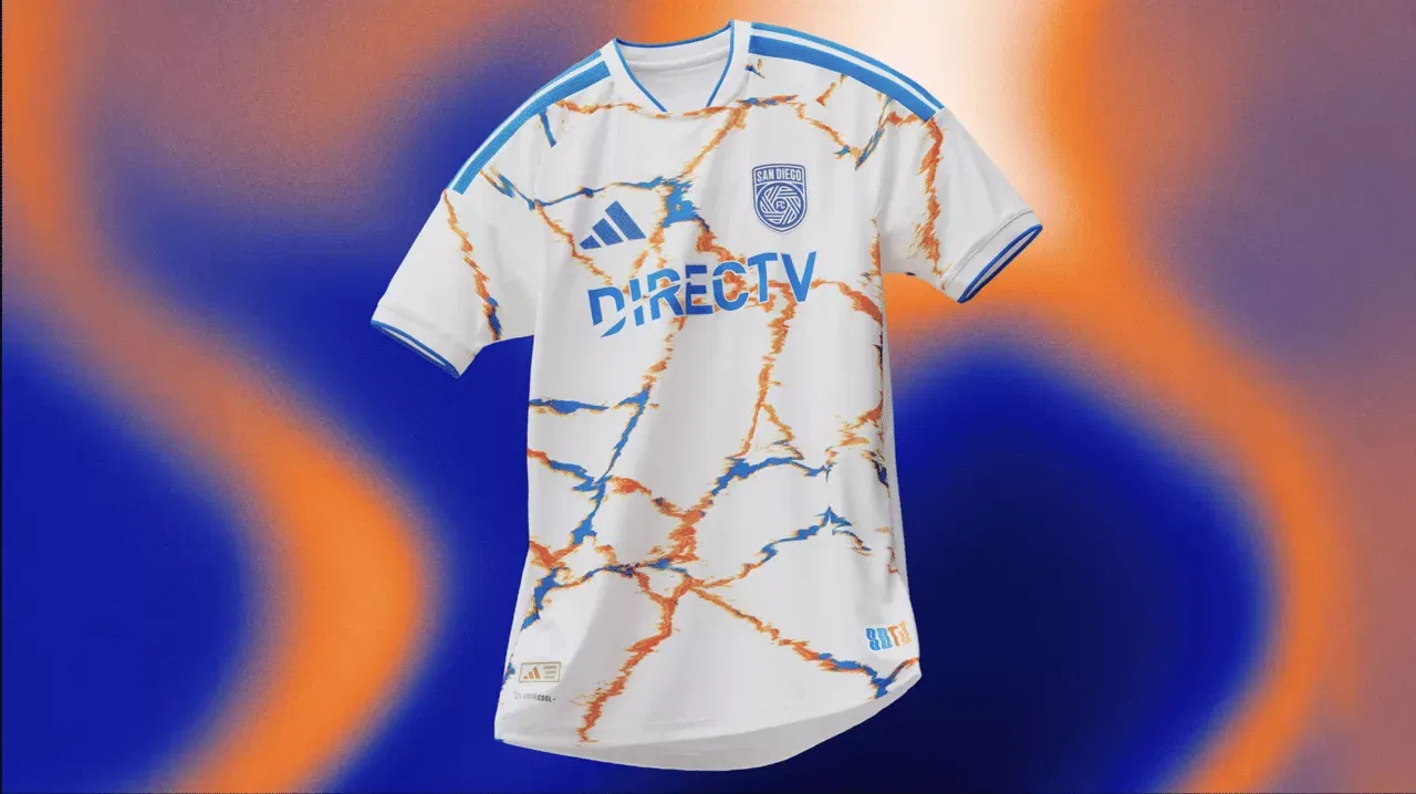
Look at San Diego FC! The good news comes after their historic first campaign, which included two mainly templated kits that were disappointing for the first year.
The fact that this is their first jersey that genuinely represents their team is the most significant aspect of this situation. At least it looks good. It was created by a local artist and is meant to connect Tijuana and San Diego, which is a lot of interpersonal relationships to put on a tee.
3. LAFC
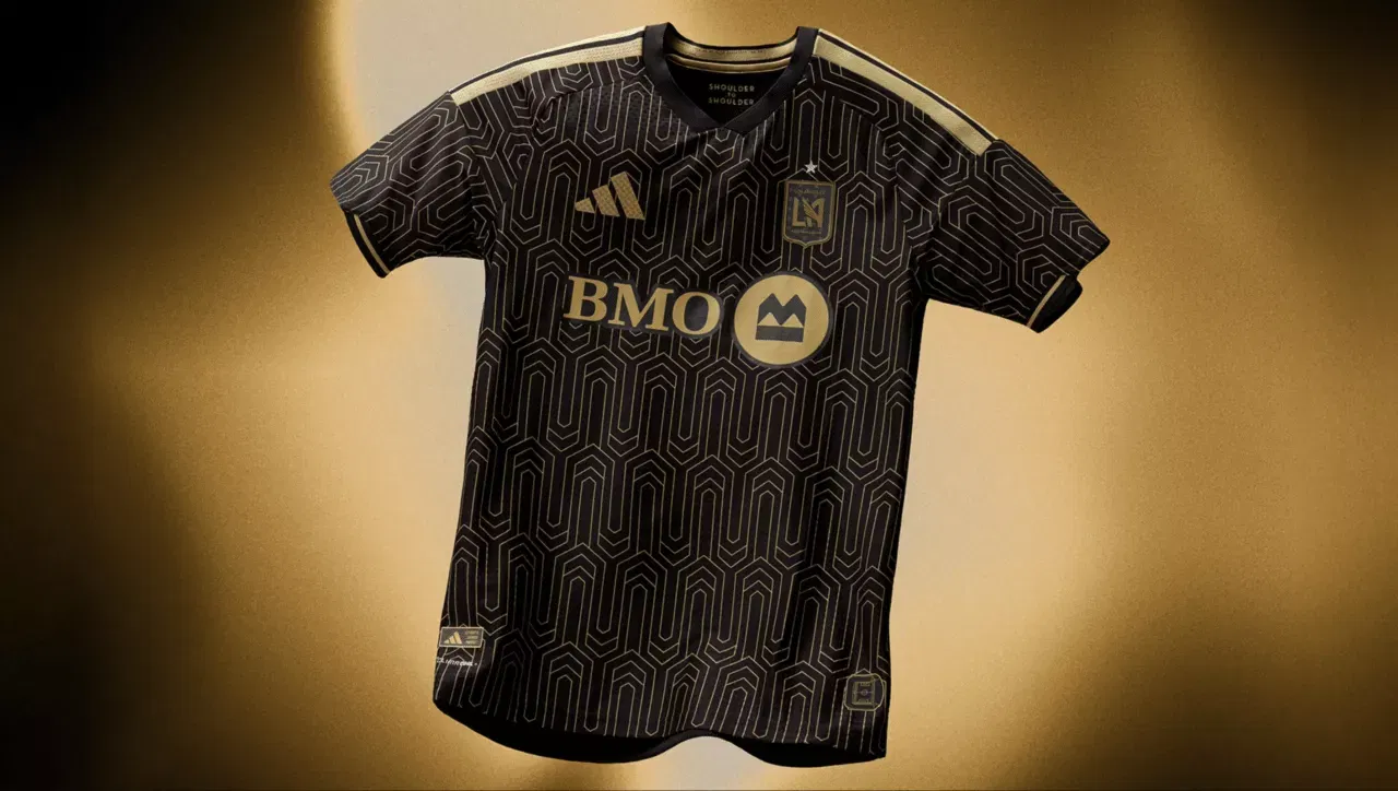
It’s difficult to create a subpar LAFC black and gold uniform, but this one is outstanding and ideal for Denis Bouanga, Son Heung-min, and Stephen Eustáquio’s first complete season together.
The class conveys just shouts “LAFC!” The designs are reminiscent of Art Deco patterns. All things considered, this kit is incredibly stylish and long-lasting.
2. Philadelphia Union
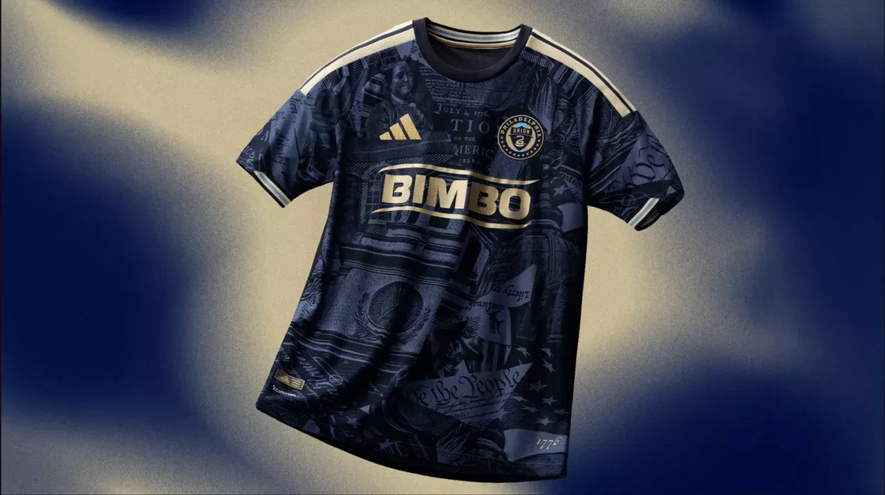
Many of the top players from the Philadelphia Union’s 2025 Supporters’ Shield-winning squad have left this season, but the 2026 uniform could help ease some of the pain.
Although it is still blue and gold, the components that allude to the city give it a distinctive look. In Philadelphia, these will be flying off the racks.
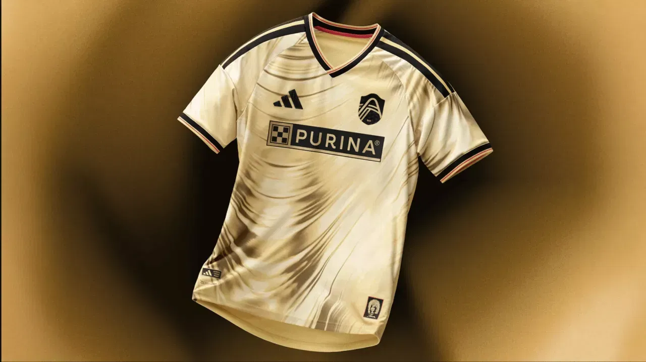
1. Atlanta United
With the black and red five stripes continuing to be their primary design, Atlanta United have surpassed all theories of that and created a genuinely famous secondary strip.
The 1996 Olympics medal design, which marked a turning point in the city’s transformation into one of America’s major commercial and athletic centres, is referenced in this jersey.
The club’s insignia is the gold medal, and the strip is the gold medal ribbon. The colours complement each other nicely. Just flawless.
Which is the best-ranked jersey for the 2026 MLS season?
Atlanta United have a highest ranked jerseys.
How does the Inter Miami jersey appear?
Inter Miami’s home jersey is plain black with Adidas and the club’s logo in pink.
For more updates, follow Khel Now on Facebook, Twitter, and Instagram; download the Khel Now Android App or IOS App and join our community on Telegram.
After earning a bachelor's degree in mass media, Rajarshi began his career as a sports writer in 2019, driven by his passion for sports journalism. He has been working in the field for over six years. A devoted fan of Lionel Messi and Barcelona, Rajarshi has been involved in sports since childhood. Before turning his focus to journalism, he even represented his college at the state level. Along with covering football, he enjoys playing the game, watching movies, and experimenting with new recipes in his spare time, as cooking is one of his favorite hobbies.